The Psychology of Brand Colors: How Color Influences Trust, Emotion & Conversions
The Psychology of Brand Colors: How Color Shapes Trust, Emotion & Conversions
Choosing your brand colors is not just a design decision — it’s a business strategy. Studies show that up to 90% of snap judgments about products are based solely on color. The human brain processes visuals 60,000× faster than text, which means your brand’s colors influence how people feel about you before they even read a single word.
In this guide, we break down the psychology behind brand colors, how different hues influence behavior, and how AI can help you create a color palette that is emotionally intelligent, memorable, and conversion-focused.
Why Brand Color Psychology Matters
Color is one of the first elements a customer notices about a brand. Global branding research reveals:
- First impressions happen within 0.1 seconds.
- Consistent brand color use increases brand recognition by up to 80%.
- Colors trigger emotional responses that directly impact trust and purchasing behavior.
Color isn’t decoration — it’s communication. It tells customers whether your brand is energetic, trustworthy, playful, premium, or innovative.
How Colors Influence Brand Perception
Every color evokes specific emotional and psychological reactions. Understanding these associations helps you select a palette that aligns with your brand personality and target audience.
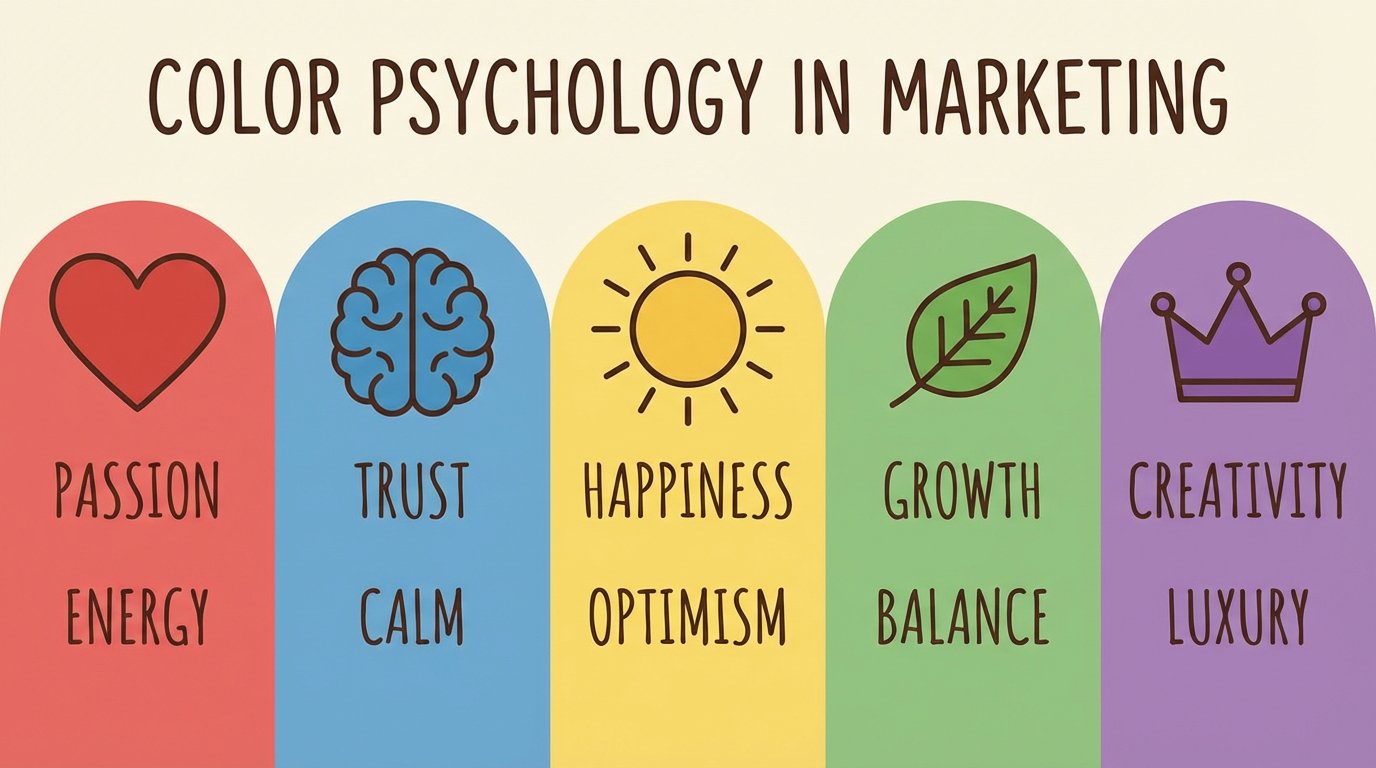
Red — Energy, Excitement, Urgency
Red grabs attention instantly. It’s used for:
- Fast food brands
- Sales banners
- High-energy industries
It stimulates action, which is why it's widely used in CTAs and urgency-driven marketing.
Blue — Trust, Stability, Professionalism
Blue is the world’s most preferred color and is strongly associated with:
- Safety
- Reliability
- Calmness
Banks, healthcare companies, and SaaS platforms use blue to build credibility and trust.
Yellow — Optimism, Creativity, Warmth
Yellow sparks happiness and friendliness. It’s excellent for:
- Lifestyle brands
- Creative industries
- Youth-targeted products
However, too much yellow can cause visual fatigue — use as an accent color.
Green — Growth, Health, Balance
Green is linked with:
- Nature
- Sustainability
- Wellness
- FinTech
It's versatile — light greens feel calming, while dark greens feel premium and trustworthy.
Purple — Luxury, Imagination, Transformation
Historically associated with royalty, purple communicates:
- Premium quality
- Vision
- Spirituality
Perfect for beauty, luxury goods, and creative brands.
Black — Elegance, Authority, Minimalism
Black is bold and timeless. It signals:
- High-end products
- Exclusivity
- Sophisticated brand identity
Techwear, luxury brands, and modern D2C startups use it effectively.
The Science Behind Color & Consumer Behavior
Color psychology affects:
1. Emotional Response
90% of purchase decisions are subconscious, and color heavily influences emotional triggers such as:
- Safety
- Excitement
- Trust
- Curiosity
- Urgency
2. Brand Recall
Brands that use consistent colors are recognized far more easily.
Example:
Coca-Cola’s red, Facebook’s blue, McDonald's yellow — these colors define their brands.
3. Conversion Rates
Color affects the performance of:
- Call-to-action buttons
- Landing page hero sections
- Product packaging
- Signup forms
Testing different CTA colors alone can increase conversions by 10–30%+ depending on the audience.
How to Choose the Right Brand Colors (Step-by-Step Strategy)
Step 1: Define Your Brand Personality
Is your brand:
- Playful?
- Premium?
- Trust-first?
- Eco-friendly?
- Energetic?
Color must reflect personality, not designer preference.
Step 2: Identify Your Target Audience
Different age groups respond differently to color:
- Gen Z — neon, bold, experimental
- Millennials — clean, minimal, muted tones
- Professionals — blue, gray, green
- Luxury buyers — black, gold, deep purple
Step 3: Study Competitors
You must stand out but remain relevant in your category.
Example:
Most fintech companies use blue or green — choosing yellow could feel off-brand unless your mission supports it.
Step 4: Build a Complete Color System
A strategic brand palette includes five groups:
- Primary brand color
- Secondary support color
- Accent/CTA color
- Neutral colors (gray scale)
- Tints and shades for flexibility
Most brands fail here — they choose random colors instead of creating a balanced design ecosystem.
Using AI to Choose Better Brand Colors
Human designers bring creativity; AI brings precision, psychology alignment, and accessibility checks.
Modern AI tools analyze:
- Brand personality
- Industry standards
- WCAG contrast levels
- Emotional tone
- Audience demographic psychology
The result is a palette that is aesthetically pleasing and conversion-focused.
AI also ensures:
- Accessible color contrast
- Harmonious relationships between hues
- Data-backed CTA selections
- Adaptability for web, mobile, and print
This reduces trial-and-error and improves brand consistency.
Real Examples of Color Psychology in Branding
Coca-Cola — Red for excitement and energy
Creates instant recognition and emotional intensity.
Starbucks — Green for harmony and growth
Represents nature, calmness, and community.
Apple — Black and white for premium minimalism
Their palette reinforces a luxury, future-forward identity.
Twitch — Purple for creativity and imagination
Purple differentiates their brand in the entertainment space.
What Happens When You Choose Colors That Don’t Match Your Brand?
Misaligned colors can cause:
- Poor first impressions
- Reduced trust
- Lower conversions
- Brand confusion
- Inconsistent identity across platforms
Your audience might even assume your product is intended for a different demographic.
The Future of Brand Color Strategy
With AI-powered systems, brands can now generate:
- Consistent color systems
- Accessible contrast-safe palettes
- Emotion-aligned color combinations
- Data-driven branding decisions
Instead of guesswork, color becomes a strategic growth tool.
Final Thoughts
Color psychology is one of the most powerful yet underrated branding tools. Your brand colors influence trust, emotions, memories, and conversions.
Combining traditional color theory with AI-driven insights ensures your palette is:
- Emotionally aligned
- Industry-appropriate
- Memorable
- Accessible and WCAG-friendly
- Conversion-optimized
When used strategically, color can elevate a brand from adequate to iconic.
Want your perfect brand color palette?
Use our AI-powered Brand Color Generator to instantly create:
- Psychology-based palettes
- Accessible color combinations
- Brand-ready export formats
- Strategic primary, secondary, and accent colors
Your color strategy is only as strong as the science behind it.
Ready to put this into practice?
Join the 30 Days of UX challenge and start building your habit today.
Start Learning for Free